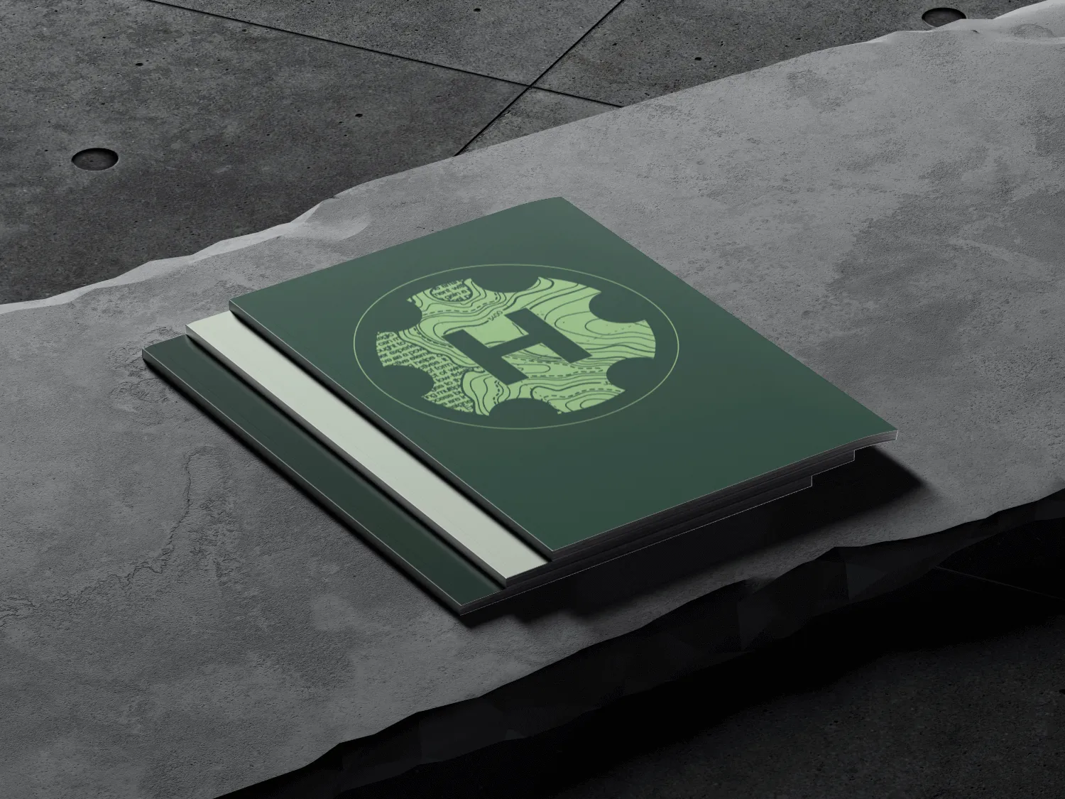
Let’s build the brand together.
These guidelines will help us define and build a consistent brand presence and experience across the world.
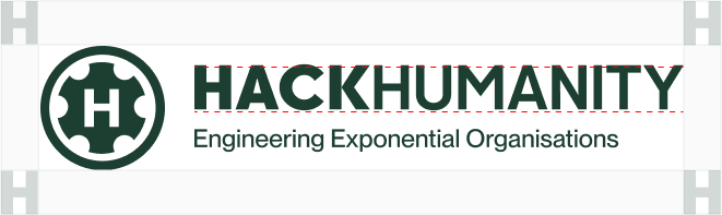
Logo
Logo variations

Primary Logo

Logo with Tagline

Vertical Logo
Icon
Inverted
This version features light green color of both icon and wordmark for legibility on dark or busy backgrounds.

Inverted Primary Logo

Inverted Logo with Tagline

Inverted Vertical Logo
Inverted Icon
Monotone

Monotone Black Primary Logo

Monotone Black Logo with Tagline

Monotone Black Vertical Logo
Monotone Black Icon

Monotone White Primary Logo

Monotone White Logo with Tagline

Monotone White Vertical Logo
Monotone White Icon
Clear Space
Our logo works best when it has enough room to breathe.
Logo
Keep a clear space of "H" around our logo at all times to maintain its visual impact in every composition. H = the height of the wordmark.
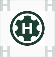
Icon
Keep a clear space of H around the icon at all times, to maintain its visual impact in every composition.
Minimum Size
Establishing a minimum size ensures that the impact and legibility of the logo is not compromised in application.

Logo
The logo should never be smaller than 120px in digital or 20mm in print.

Icon
The icon should never be smaller than 32px in digital or 8mm in print.
Best practices
Here’s a few examples of what we should absolutely avoid when using the logo.
Don’t use gradients or shadows
Don't use other colors
Don't use other typeface
Don't stretch or squeeze it
Don’t use the wordmark alone
Don't use outline or create keyline around the logo
Don’t use against low-contrast
Don’t use busy backgrounds